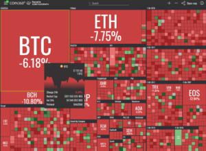
In the fast-paced world of cryptocurrency, market trends shift rapidly, requiring traders to stay ahead with real-time data. Traditional price charts and numerical tables provide detailed insights, but they can often be overwhelming. This is where the Crypto Heat Map comes in—a visual representation of the market that simplifies complex data, helping traders make informed decisions at a glance.
A Crypto Heat Map is an essential tool that allows traders to see market movements, price trends, and trading volume in real-time. It highlights bullish and bearish trends using color codes, making it easier to spot opportunities and risks. But how exactly does it work, and why is it so crucial for crypto traders? Let’s dive in.
What Is a Crypto Heat Map?
A Crypto Heat Map is a color-coded visualization that represents real-time cryptocurrency market data, such as price movements, trading volume, market capitalization, and liquidity levels. Instead of displaying raw numbers, it uses colors (typically red and green) to indicate performance:
- Green: The asset is gaining value (bullish movement).
- Red: The asset is losing value (bearish movement).
- Darker shades: Indicate stronger trends, while lighter shades suggest milder price fluctuations.
Types of Crypto Heat Maps
- Price Heat Map – Displays price fluctuations across various cryptocurrencies.
- Volume Heat Map – Shows trading volume intensity, helping traders identify liquidity.
- Liquidity Heat Map – Highlights buy/sell orders and market depth.
- Order Book Heat Map – Tracks buy/sell orders across exchanges to predict price trends.
These variations provide traders with a quick snapshot of the crypto market’s current condition and can be used to identify trends, market momentum, and potential trading opportunities.
Why Is a Crypto Heat Map Important?
1. Quick Market Analysis at a Glance
Traders don’t always have time to analyze complex candlestick charts and read through multiple data points. The Crypto Heat Map provides an instant overview of market conditions, allowing traders to spot profitable opportunities and potential risks in seconds.
2. Identifies Market Trends Instantly
Instead of manually comparing multiple assets, a heat map highlights bullish and bearish trends in real-time. For example:
- If most assets on the heat map are green, the market is in a bullish trend.
- If red dominates, a bearish market may be forming.
This allows traders to quickly adjust their strategies based on the overall market sentiment.
3. Helps in Risk Management
The Crypto Heat Map enables traders to avoid risky trades by identifying overbought or oversold conditions. If a cryptocurrency shows a sharp red decline, it may signal a potential sell-off or upcoming reversal. Likewise, a deep green increase could indicate a price surge with strong momentum.
4. Enhances Liquidity Monitoring
For large-scale traders and whales, liquidity is a key factor. A Liquidity Heat Map helps in identifying:
- High liquidity zones (good for entering/exiting trades without high slippage).
- Low liquidity zones (can indicate possible price manipulation or lack of interest).
By understanding where liquidity is concentrated, traders can optimize trade execution and minimize losses.
5. Perfect for Scalping and Day Trading
Short-term traders and scalpers rely on quick price movements. A heat map provides real-time data on price fluctuations, enabling them to enter and exit trades with precision. High-frequency traders (HFTs) also use heat maps to capitalize on short-term volatility.
6. Useful for Exchange Comparisons
Some crypto heat maps allow traders to compare different exchanges. This helps in:
- Finding better trading pairs with lower spreads.
- Identifying price discrepancies across exchanges for arbitrage opportunities.
- Monitoring exchange-specific liquidity and volume trends.
How to Use a Crypto Heat Map in Trading
To fully benefit from a Crypto Heat Map, traders should:
- Analyze Overall Market Sentiment
- If the majority of assets are green, it may be a good time to buy.
- If most are red, it might be better to wait or short-sell.
- Check Specific Cryptos or Sectors
- Heat maps allow traders to filter data based on sectors (DeFi, Metaverse, Layer 1 vs. Layer 2 solutions).
- This helps in finding strong-performing sectors within the crypto ecosystem.
- Monitor Trading Volume
- High volume (darker green or red) indicates strong interest, which can signal major breakouts or breakdowns.
- Low volume suggests weak trends, meaning a price move might not sustain.
- Look for Overbought & Oversold Assets
- Cryptos that are deep green may be overbought, signaling a potential correction.
- Those that are deep red may be oversold, presenting buying opportunities.
Best Crypto Heat Maps Available
Here are some popular platforms offering free crypto heat maps:
- Coin360 – One of the most widely used crypto heat maps.
- TradingView – Provides customizable heat maps for crypto and other assets.
- Crypto Bubbles – A unique heat map with interactive visual elements.
- Binance Heat Map – Exchange-specific heat map for Binance users.
Each of these platforms provides traders with valuable insights into market conditions, making it easier to execute informed trades.
Conclusion
A Crypto Heat Map is an indispensable tool for traders looking to make quick, data-driven decisions. By offering a visual representation of market trends, liquidity, and trading volumes, it simplifies complex data analysis, making it accessible even to beginner traders.
With features like real-time price tracking, trend identification, and risk assessment, crypto heat maps empower investors to make more confident trading decisions. Whether you’re a day trader, swing trader, or long-term investor, incorporating a heat map into your strategy can significantly enhance your market analysis.
Also Read: Best Crypto Blockchain: Top Crypto Blockchain Project To Buy